In the ever-evolving world of the internet, one thing remains constant: the need for a compelling and user-friendly website. The design of a website isn’t merely about its aesthetic appeal. It encompasses its usability, how it communicates its message, and how effectively it engages users. In this blog, we’ll delve deep into website design ideas, gain some website design inspiration, explore various web design ideas, and discuss how different website layouts can make or break your digital presence.
The Magic of Website Design Ideas
Imagine walking into a physical store. The first thing that captures your attention is its layout, lighting, and product placement. Similarly, when users land on your website, its design is the first thing they notice. Thus, web design is a pivotal aspect of your online identity.
- Purpose-driven design: The core of any web design should be its purpose. Whether it’s an e-commerce platform, a portfolio, or a blog, ensure the design elements align with the intended purpose.
- Color psychology: The colors used on your website can evoke specific emotions in your users. For instance, blue often signifies trust, while red can signify urgency.
- Typography and readability: Ensure that the content on your website is readable and attractive. The choice of font, its size, and spacing can make a significant difference.
Diving into Website Design Inspiration
Where do you look when you’re in need of some inspiration? Here are some proven strategies to get those creative juices flowing:
- Study competitors: Analyze websites from your niche. It’ll give you insights into what’s working and where there’s room for innovation.
- Visit design showcases: Websites like Awwwards, Behance, and Dribbble host the best designs from around the world and can be a fantastic source of inspiration.
- Travel and nature: Sometimes, stepping away from the digital realm and soaking in the natural world or different cultures can give you fresh perspectives.
Web Design Ideas to Consider in 2023
The digital landscape is always evolving, and staying updated with current trends can make your website stand out. Here are some modern web design ideas:
- Dark mode: With many apps and OS offering a dark mode, designing a website that offers this option can be both user-friendly and trendy.
- 3D elements and animations: They can make your website interactive and engaging. With web technologies advancing rapidly, integrating 3D elements has never been easier.
- Voice User Interface (VUI): With the rise of voice-activated devices, designing websites that can interact with voice commands is the future.
- AI and chatbots: Integrating AI-driven chatbots can significantly improve user interaction and provide instant support.
The Importance of Website Layouts
Your website’s layout is like the blueprint of a building. It dictates how users navigate and interact with your content.

- The F-layout: This is based on the natural pattern of reading in most Western cultures—left to right and top to bottom. Thus, the top and left parts of your site get the most attention.
- The Z-layout: Ideal for websites that want to highlight multiple points of interest, guiding the viewer’s eye in a path that mimics the letter Z.
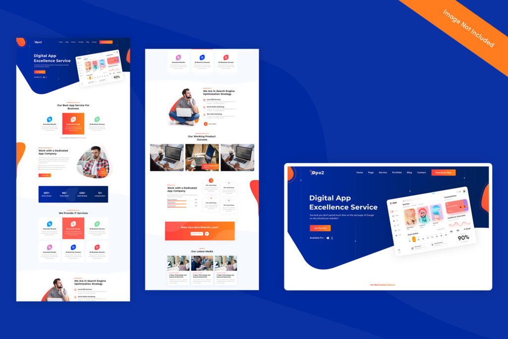
- Grid-based layouts: These create a clean look, making content easy to absorb. Websites like Pinterest popularized this layout.
- Single page or infinite scroll layouts: For stories or content that’s best consumed in a flow, this layout can be effective. However, it’s crucial to ensure that the site doesn’t become too lengthy or overwhelming.
The best websites are built around a strong foundation.
The best websites are built around a strong foundation. They allow users to easily navigate and use the site, making it easy for them to find what they need and contact you if they have questions or concerns.
A good website will also be easy on the eyes, both visually and in terms of text size. Small fonts make it easier for people with visual impairments (like me) to read your content without straining their eyesight or causing eyestrain later on down the road!
The main website content should be displayed on the homepage.
The main website content should be displayed on the homepage.
It’s important to keep in mind that, as an online business, you want your site visitors’ first impression of your company to be positive. If they don’t know what they’re looking at, or how to navigate through it, then chances are you won’t get their attention and engagement either! So make sure there’s enough information on this page so people can find what they need quickly and easily. For example: if someone lands here after visiting one of our stores (or any other website), then why not give them some background info about us? Also consider including links back into other pages like our blog or social media accounts so users can also see those things when browsing around as well – this will help build trust between businesses who run websites together!
You might also want to consider adding a search bar at the top of your homepage, as this will help visitors find what they need even faster. You could also include some social media buttons on this page as well so users can connect with you in other ways if they want. Remember that people are coming to your site because they want something – so make sure there’s enough information here so people can find what they need quickly and easily!
Secondary sections can provide additional information about your business or product.
Secondary sections are important for providing additional information about your business or product. They can be used to highlight the benefits of using your service, or they can be used to detail the services you offer.
- Provide a brief overview of what makes your company different from others in its industry (if it isn’t obvious already). This will help people who are researching competitors and get them interested in learning more about what makes you stand out from the crowd!
- Include links back to other parts of your website for more information on each topic covered by secondary sections. If someone looks at one section, but has questions about something else related to their search query, he/she might want click over there instead because those linked pages provide answers that make sense given his/her context when looking at an individual piece of content online like this example below:
Consider creating a sign-up form on your homepage.
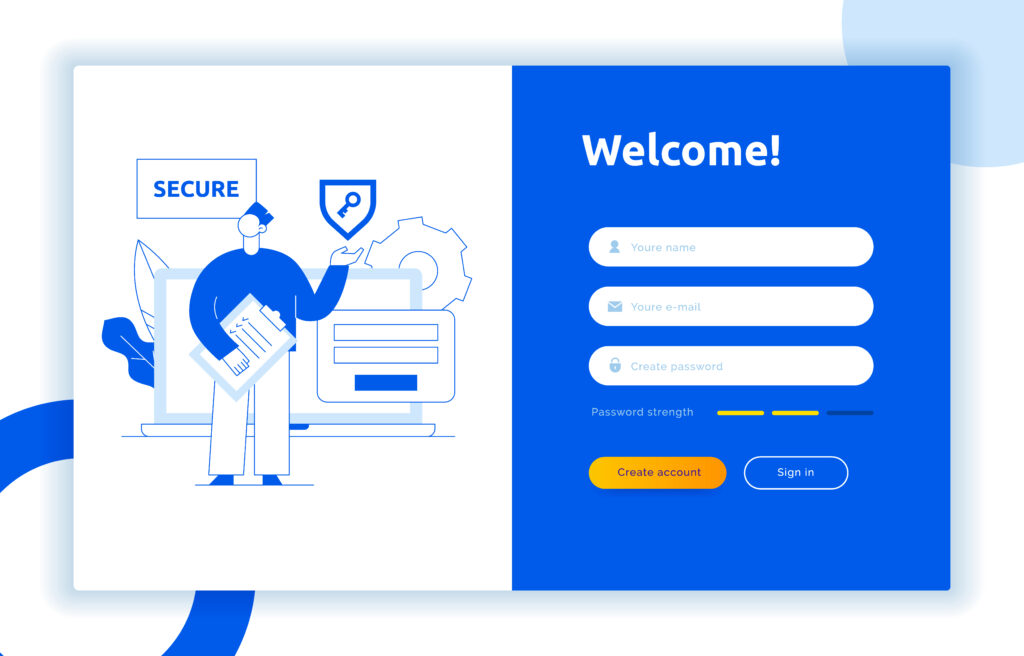
A sign-up form is a great way to capture information from your visitors. You may want to use this as an opportunity for them to give you their email address, phone number or other contact information (like a business card). If they have not given you this information yet, it can be useful for later follow-up purposes.

In addition to capturing contact info, consider using the form for capturing payment information and credit card details if applicable. It makes sense that people would want their payments processed securely by the site owner rather than leaving security in the hands of third parties like banks or credit card companies (who often charge high fees).
Use images and videos to capture the user’s attention.
Images and videos are a great way to capture the user’s attention, as they can create a sense of familiarity, trust and urgency. Using images will help you create a feeling that your website is an extension of yourself.
- Familiarity
Use images that remind people who they are and what they like. For example: if you’re selling children’s toys, use pictures of kids playing with their favorite toy(s). If it’s about pets then show pictures of your furry friends doing fun things like playing in the water or chewing on their favorite toy(s). You don’t have to limit yourself with just one photo—you can also add video clips so that users get even more engaged!
Display links back to other pages as well as information about your services and products.
The links should be displayed in a clear and easy to read manner. This means that you should use descriptive text, as well as lists or tables where possible, to make it easy for users to find what they need on your website.
- Make sure that the links are easy for people without special knowledge about your product or service (such as those who may not understand technical terminology) to navigate through quickly and efficiently.
- Linking back to other pages on your site is also important because this shows that visitors can easily access more information about topics related to their interests if they choose (or even if they don’t).
Add interactive elements such as polls, search bars and calculators for more interaction with your users.
The next step is to add interactive elements such as polls, search bars and calculators for more interaction with your users.
Use a friendly tone when writing emails, newsletters and other forms of communication. This will help to build trust with your audience by making them feel like you are on their side instead of just pushing content at them.
You can also use conversational language in articles or blog posts that encourage the reader to interact with each other by sharing comments or links back to yours (which will help increase traffic).
A website design will make or break how effective your business is
A website design will make or break how effective your business is. The way that you look online can make a huge difference in the way people perceive you, so it’s important to pay attention to this aspect of your company.
A website should be easy to navigate and understand. The more difficult it is for visitors on its pages, the less likely they’ll return for future visits (and thus spend more time browsing other sites). You want people coming back because they enjoyed themselves there—not because they couldn’t figure out where anything was! To ensure that happens, keep these tips in mind:
Conclusion
As the digital face of your brand, your website’s design can be a make-or-break factor in your online success. By staying updated with the latest website design ideas and deriving website design inspiration from various sources, you can ensure that your site remains relevant, engaging, and user-friendly.
Remember, the world of web design is vast and full of possibilities. Be open to experimentation, keep the user’s experience at the forefront, and watch your digital space thrive!


